About:
X product is a family of PoS products built on premise for 1k+ restaurants for over 20 years.
Challenge
On premise approach caused an inconsistent UX across multiple devices and architectures, making the business not sustainable.
Impact
I designed the first universal design system preserving a familiar UX logic to avoid rapidly breaking habits in a highly stressful context.
Team:


My role
Design patterns analysis
First adaptive design system
Key flows analysis
Key flows redesign
Timeline
May 2019 - April 2020
"Vintage” design discovered on the first work day
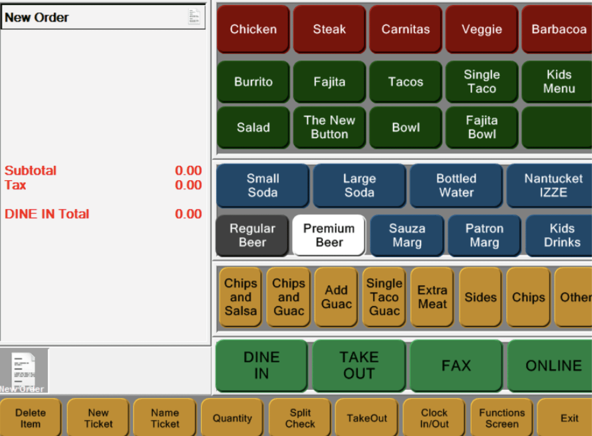
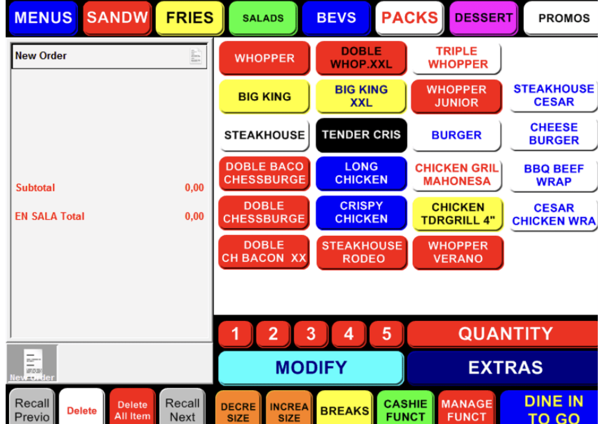
It started from a buy-in prototype…
TBA
TBA
3 stages to redesign a product w/20y of history:


Chapter #1
The patterns analysis
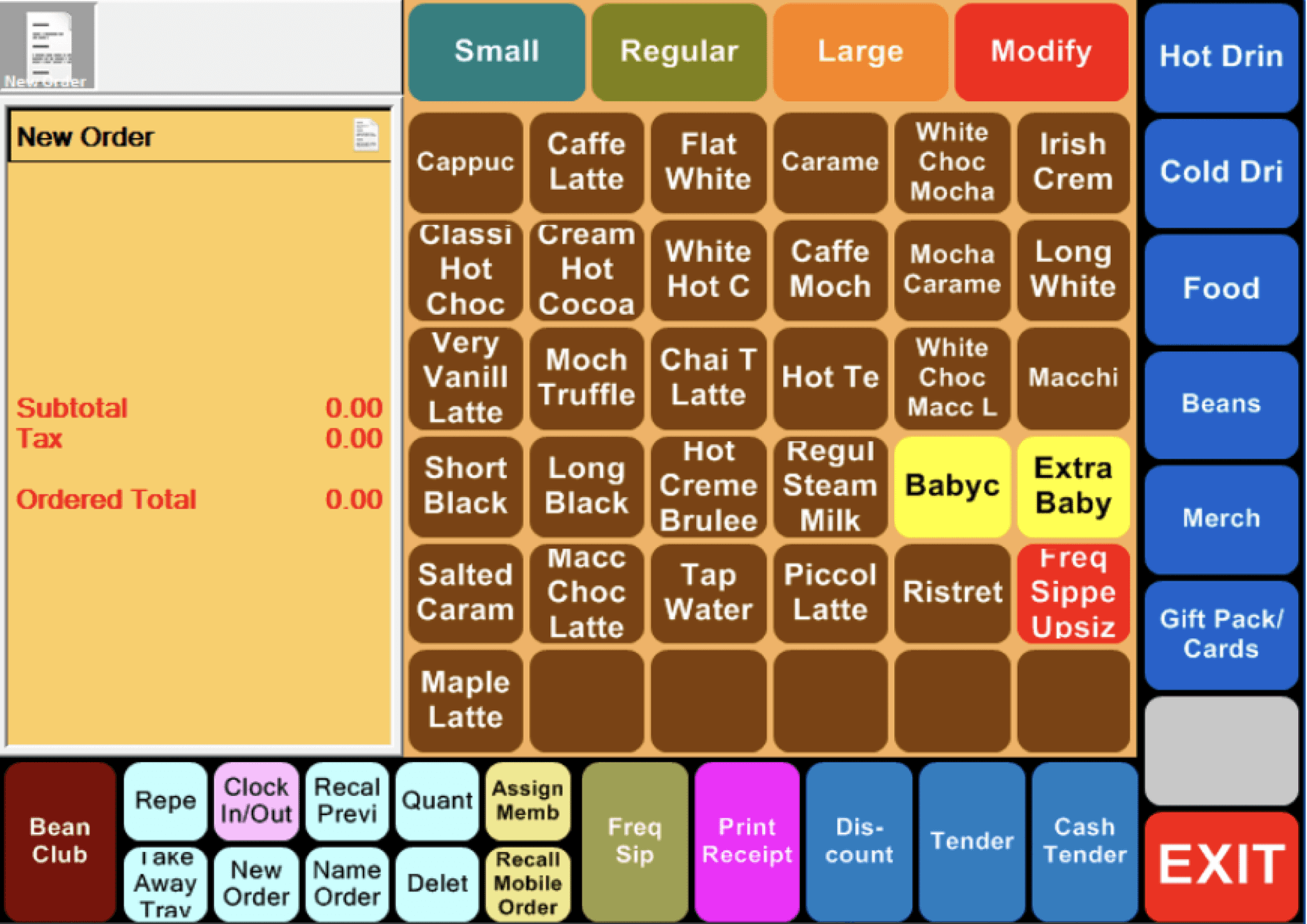
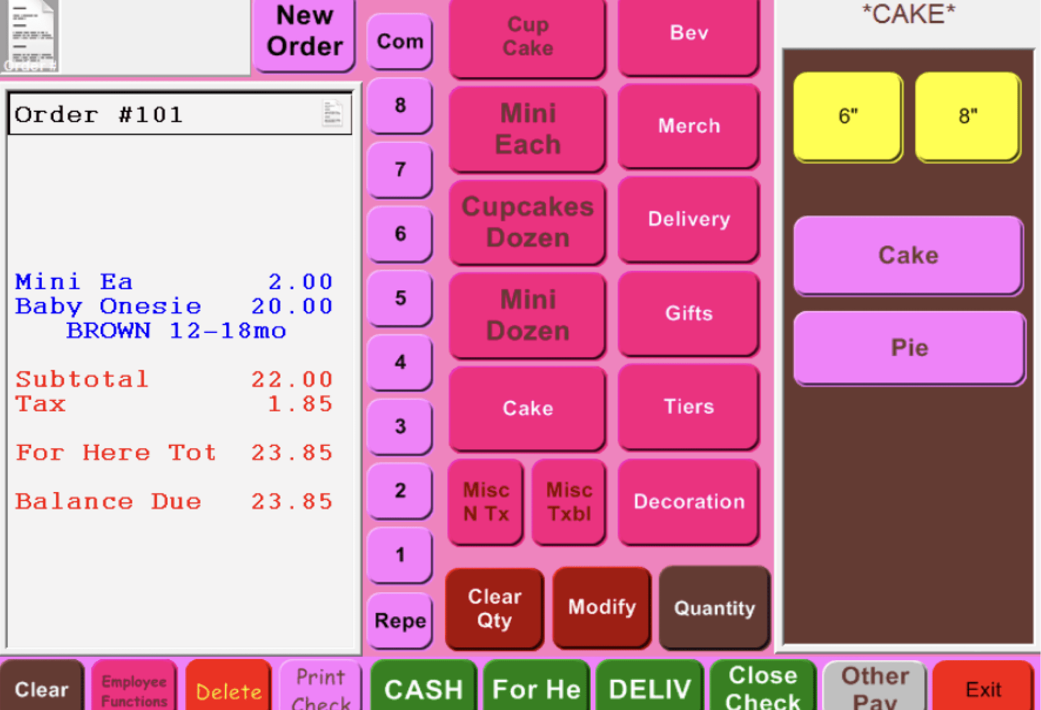
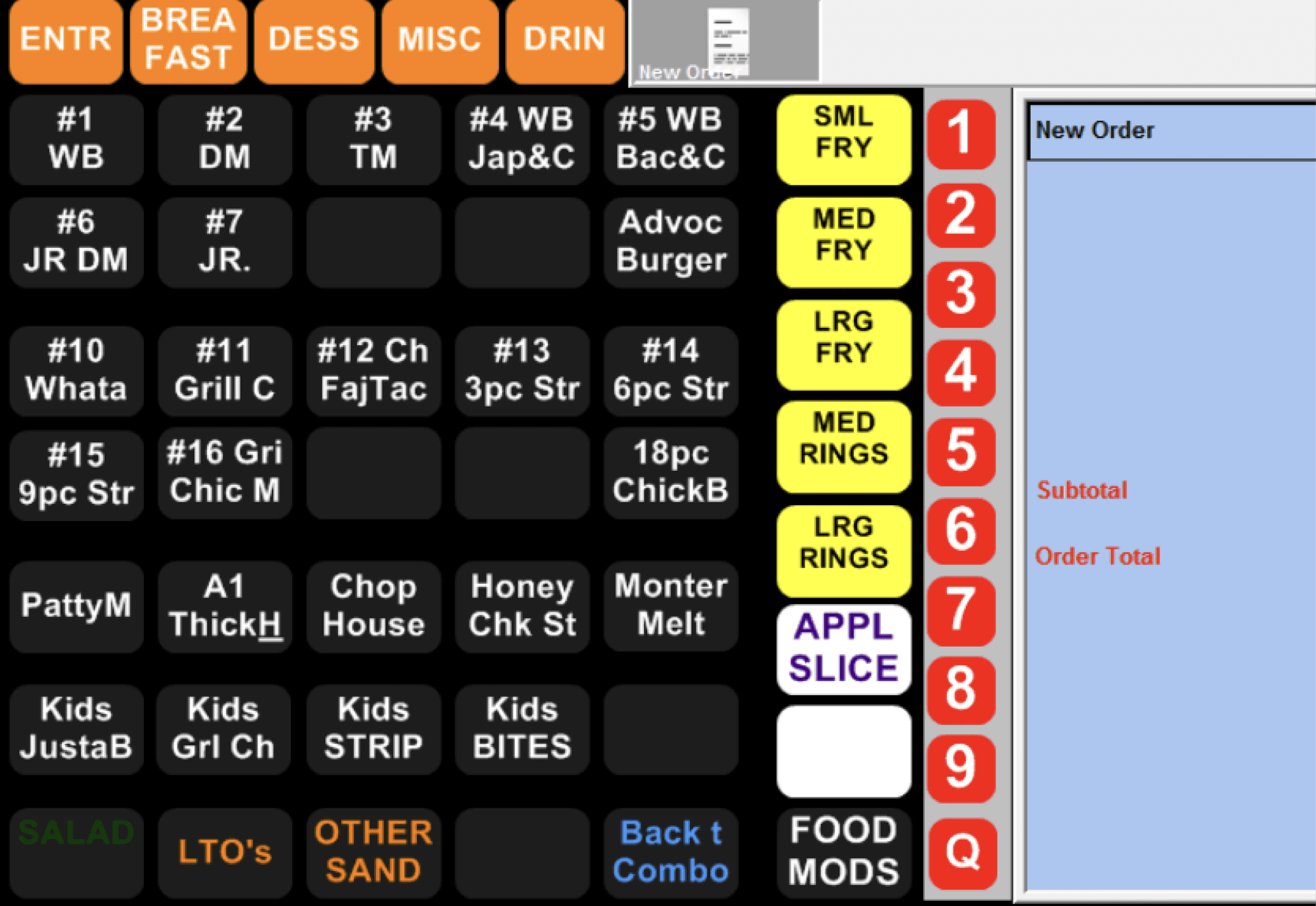
The objective was to find a universal default layout for all new customers. After analyzing 100+ custom layouts, I identified 6 patterns by breaking down the layouts into key actions and exploring different compositions.


Product context
Product with 20y of history implies strong user habits and muscle memory.
->
Design principle
Preserve existing navigation & interactions to avoid rapid UX disruptions.
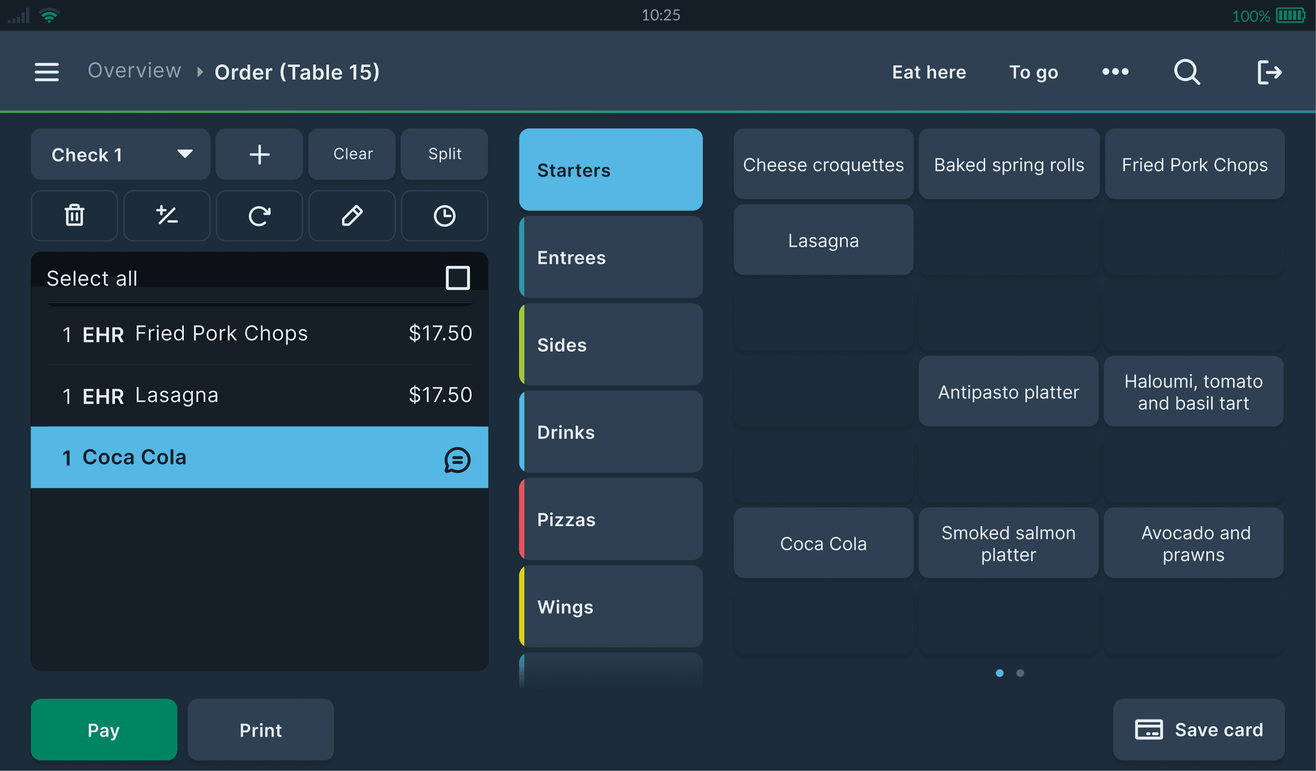
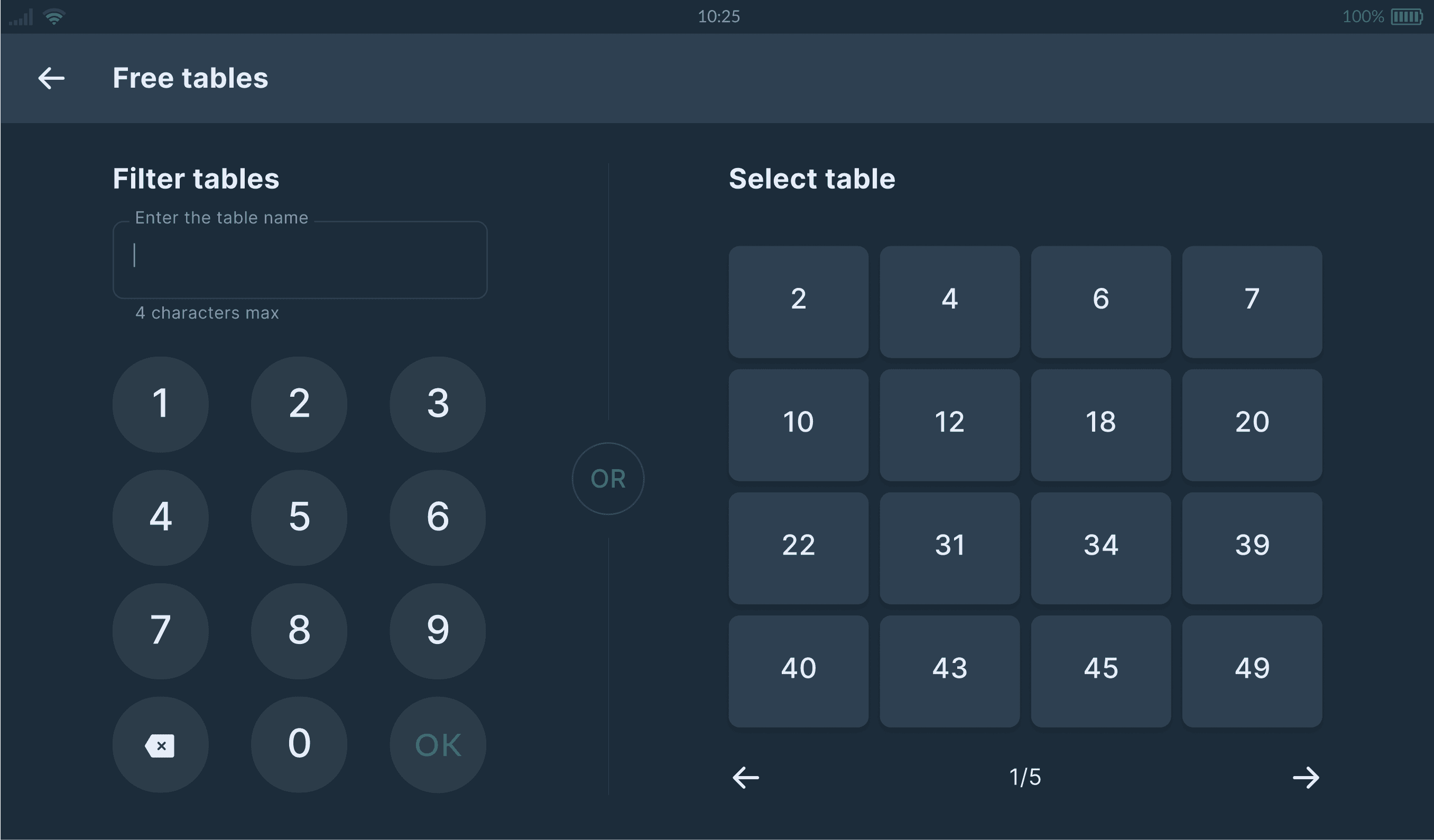
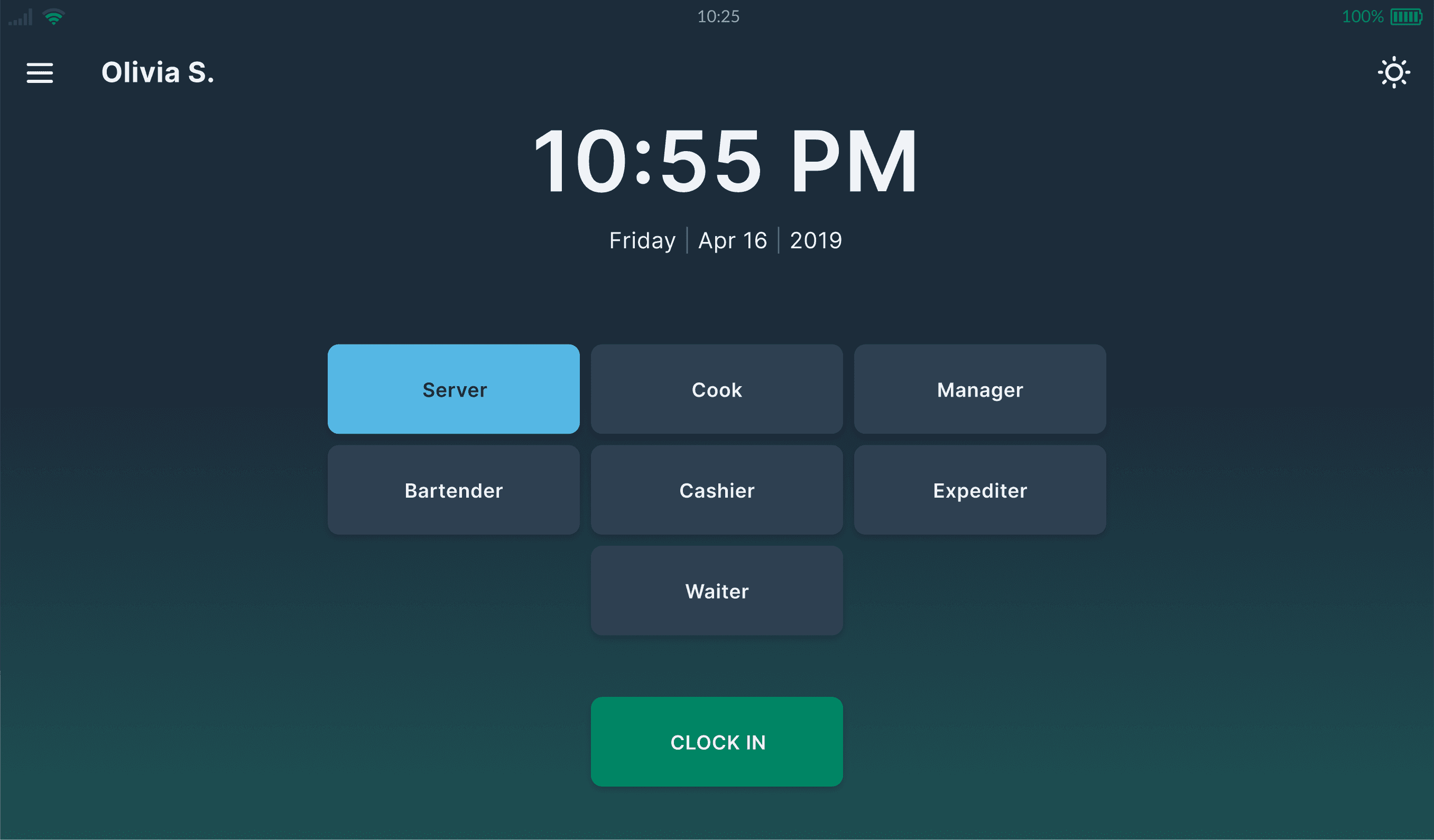
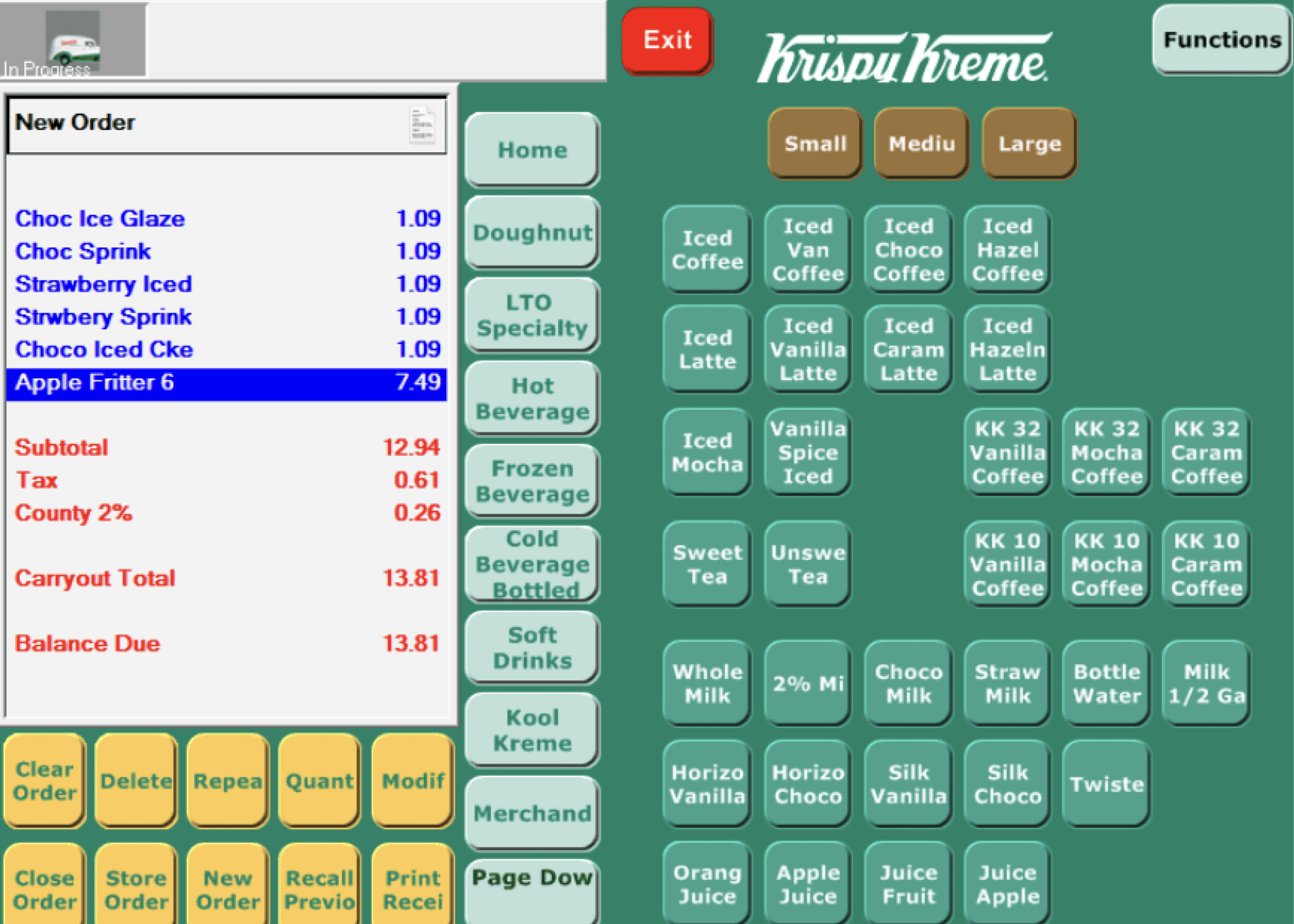
The chosen default layout
*Use arrows to compare before/after
Preserving familiar scanning logic
F-scanning: Check -> Menu -> Submenu
Top bar for navigation & search
Bottom bar for main CTA actions
Predicable buttons locations for efficiency
Chapter #2
The visual language
Using an atomic design system approach we decided to not reinvent the wheel. For the visual style, we aligned on the blend of Material Design 2.0 elements with new
Two color modes & tokens
Backgrounds
Container
#0B1117
Main
#1C2C3A
Primary
#2E4051
Secondary
#161F28
Disabled
#2E4051
Opacity: 50%
Secondary BG
#374B5E
Text & icons
Enabled
Text
Fill: #F4F5F7
Secondary
Text
Fill: #889DB2
Pressed
Text
Fill: #161F28
Disabled
Text
Fill: #4C667D
Highlighted
Text
Fill: #55B7E4
Awaiting
Text
Fill: #ED9A23
Error
Text
Fill: #ED5562
Borders
Primary Border
#2E4051
Size: 1px
Secondary Border
#F4F5F7
Size: 1px, Opacity: 12%
Selected
#55B7E4
Size: 1px
Attention
#ED9A23
Size: 1px
Error
#ED5562
Size: 1px
Shadows
Modal
#000000
FAB
#000000
Header
#000000
Button
#000000
Product context
Restaurant work requires adapting to varying indoor and outdoor lighting.
->
Design principle
Design both Light & Dark modes, where the color mode can be switched automatically.
Color accessibility mode
95% of people
Will see the palette
Contrast 7.36:1
AA
AAA
Pressed - Selected
Contrast 7.33:1
AA
AAA
Attention - Awaiting
Contrast 4.56:1
AA
AAA
Error - Problem
Contrast 4.62:1
AA
AAA
Success - Confirm
6% of men
Deuteranomaly
Pressed - Selected
Attention - Awaiting
Error - Problem
Success - Confirm
1% of men
Protanopia
Pressed - Selected
Attention - Awaiting
Error - Problem
Success - Confirm
1% of people
Tritanopia
Pressed - Selected
Attention - Awaiting
Error - Problem
Success - Confirm
Product context
Designing for 1.2M DAU involves a strong emphasis on accessibility, with extra attention to payment status color modes.
->
Design principle
Design for sight impairments, making sure that green & red colors in payment contexts are accessible to everyone.
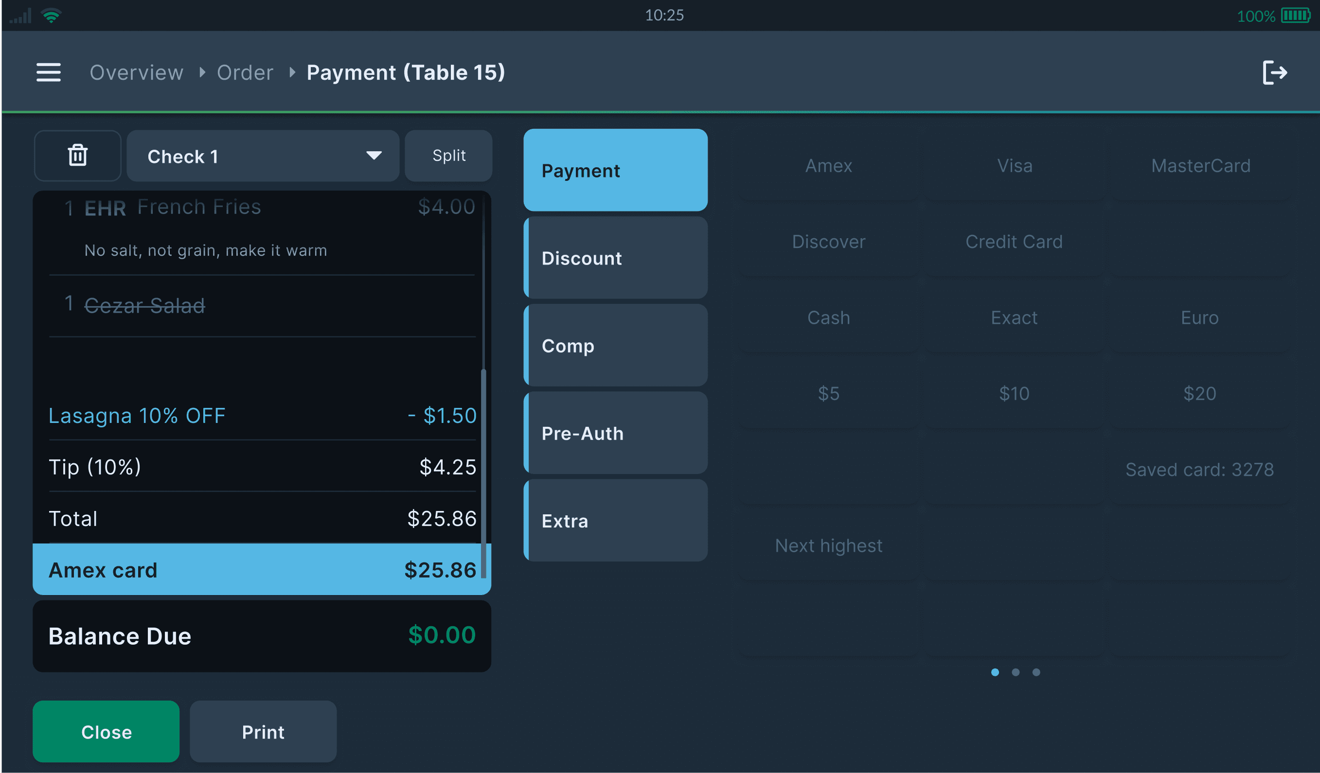
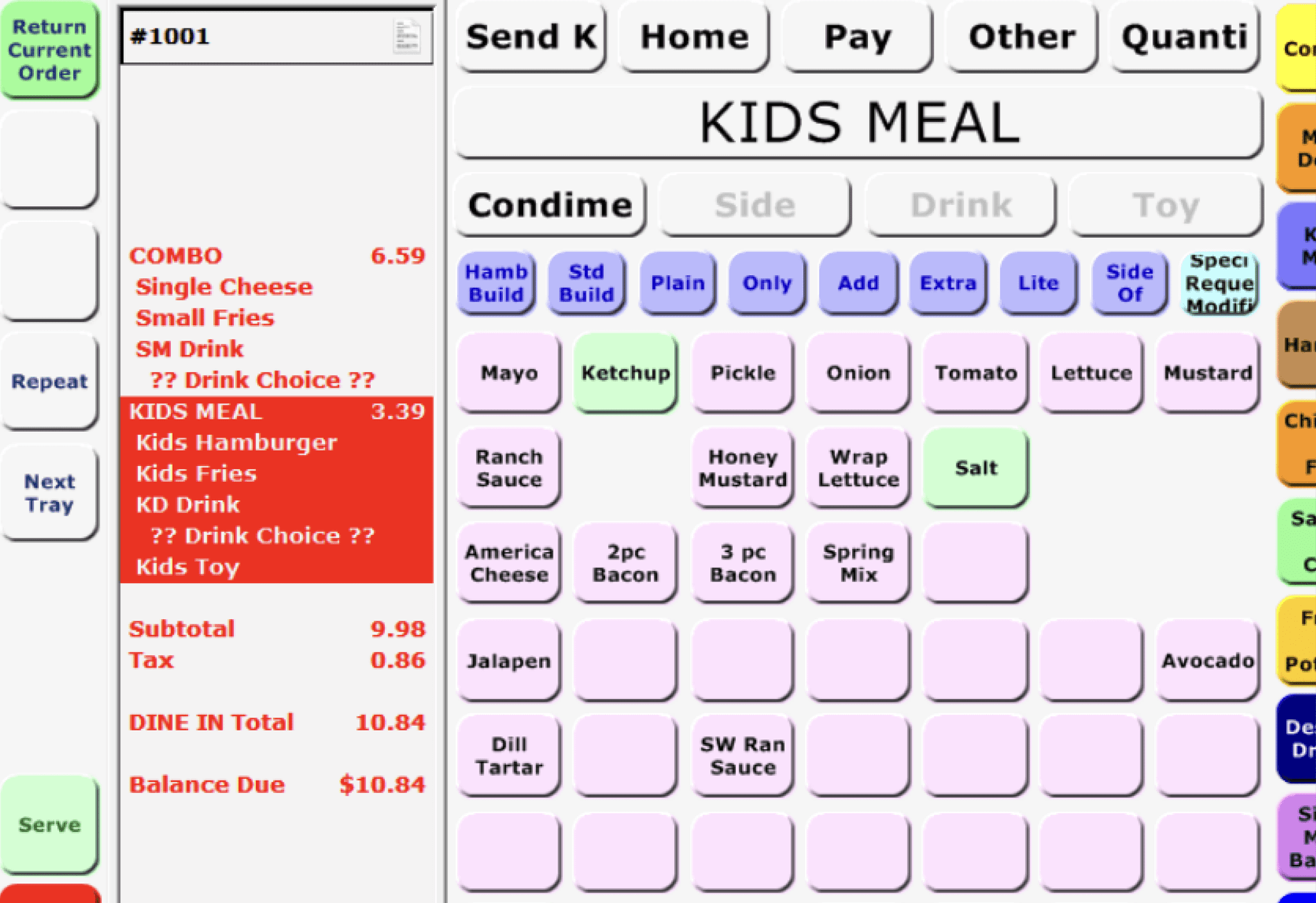
New layout meets visual language
Key experience screens using tokens & components on the new default layouts